INK APP
UX Design / Research
INK is a digital notebook app designed in collaboration with Monterey Bay Aquarium. Over the course of six months, I led a five-person team through foundational research, several design cycles, usability testing, and delivery of a final prototype that exceeded client expectations.
As a result of my team’s work, our client has the resources they need to pitch the app for internal/external funding and hand it off to future development teams, with potential impact for students and teachers worldwide.
01 a quick look
CLIENT
Monterey Bay Aquarium / 2019
My Contributions
- Product management
- UX research
- UX design
- Prototype design
- Video editing
TEAM
OPPORTUNITY
After several years of using existing apps in their 6-12th grade educational programs, our client wanted a more complete solution for student and teacher needs. Our team’s goal was to leverage user-centered design to deliver a digital notebook app prototype for iPad.
Process
Our early focus was on foundational research, which supplemented the client’s existing research and domain knowledge. We conducted a literature review, competitive analysis, field observations, interviews, focus groups, and a card sort to discover and prioritize user needs.
Next, we moved into iterative prototyping and usability testing with students and teachers. This feedback from users helped us to create a robust set of deliverables for the client, including an interactive prototype (Figma), pitch video for stakeholders, website, style guide, and documentation.
Impact
This was a six-month capstone project, organized through UC Irvine’s Master’s of Human-Computer Interaction & Design program (MHCID). Since we had a limited window to deliver a product that our client could use as a jumping off point for future app development, it was crucial for us to maximize our impact.
Our final deliverables (prototype, video, website, and documentation) were designed to help our nonprofit client seek funding from stakeholders and donors, and provide guidance to future development teams after funding is secured.
Working on INK has been one of the most interesting and inspiring projects of my career. I feel extremely privileged to have collaborated closely with people (of all ages) who are passionate about education, science, and conservation. I share our client’s hope that this app–once funded and launched–can be offered for free to teachers and students across disciplines and around the world.
02 INK in action
Want to learn more?
This complex project involved six months of research & design.
Scroll on for the full case study!
03 origin story
WHY THIS PROJECT?
As a pioneer of STEM education, Monterey Bay Aquarium helps students build lifelong technology and science skills. The aquarium wanted to create a science notebook tool designed specifically for education, since existing apps are not tailored for classroom use.
WHY NOW?
MBA’s education department is growing rapidly. The $42 million Bechtel Education Center opened in 2019 and has invested heavily in learning technologies like smart classrooms, innovation labs, recording spaces, and more. Education is an institutional priority.
This digital notebook app is a dream project for MBA. They have been using other notebook apps in their education programs, but nothing has quite fit the bill in terms of features, platform, and price.
Ultimate goal
An app that brings together elements of collaboration, ownership, and reflection. It should be cross-platform, so that students can use it in the field, in the classroom, and at home.
Our project was the first step toward this goal: An interactive prototype to guide development and funding.

04 timeline
This six-month project began with foundational research and ideation, followed by iterative prototyping.

05 current landscape
Client experiences
Based on their experience using paper notebooks and digital solutions with teachers and students, Monterey Bay Aquarium’s education staff had a clear idea of the features that they wanted in their dream app:
- Content creation (text, annotation, photos, videos, audio)
- Multi-platform access
- Easy organization
- Feedback & assessment (from teachers & peers)
- Language recognition and translation
- Data collection tools using sensors
- Data visualization tools
Review of existing apps
We gathered feedback from our client on apps they’d already used for this purpose. Education staff walked us through each one, describing what they liked, where they struggled, and how teachers and students experienced each app in the classroom.
Next, we reviewed apps on the market to compare features, strengths, and weaknesses based on user feedback and feature ratings. Notability, Google Science Journal, Evernote, OneNote, and Zoho Notebook were a few of the apps we examined.
Literature review
Finally, we reviewed academic papers and studies to learn what experts had to say about notebooks, technology use in the classroom, and designing engaging tools for education.


06 understanding our users
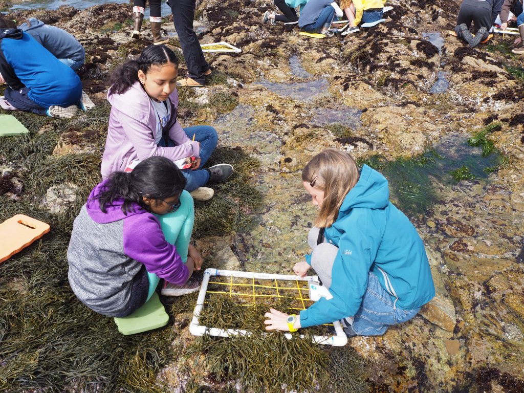
FIELD OBSERVATIONS
We observed middle school students collecting data at tide pools, and came away with some key findings on small group collaboration, note-taking, data collection, attention span, and scaffolding.
This allowed us to gain a better understanding of group dynamics and student needs. We also saw how teachers integrated classroom materials into fieldwork, and determined use cases for our digital notebook app.
Interviews & focus groups
Speaking to teachers and education staff helped us understand their current processes and the limitations they face. We learned that students are most successful when given the freedom to set up their own notebooks and organize their thoughts, supplemented with activities and guidance from the teacher. Peer and teacher feedback are both critical to the learning process, and students are encouraged to “tell a story” with their data.
Students and teachers struggle with the limitations of paper notebooks; teachers have to carry around dozens of notebooks at a time for feedback and assessment. They’re also easy to lose and difficult to convert to other formats for future reference.
Digital tools bring their own challenges. Many students don’t have consistent access to technology or wifi outside the classroom. Feedback on assignments is most useful when it is timely, specific, and actionable, but teachers find it difficult to meet this goal with their existing tools.
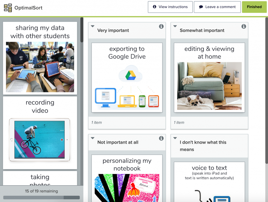
Card sort
After synthesizing our preliminary research and arriving at a list of potential features, we wanted to discover which features were most important to our users.
We conducted a remote card sort with 36 teachers (across all disciplines) and 49 middle and high school students. Both teachers and students sorted features into categories of importance.
- Students showed a strong preference for data management, even more so than teachers.
- Text input and photos were much more important to students than other media types.
- Students are more interested in teacher interactions than peer-to-peer feedback.

07 planned features
content creation
- Type text
- Take photos
- Collect data w/ sensors
- Push content to devices
collaboration
- Share with others
- Peer feedback
- Teacher feedback
ownership
- Organize content
- Personalize
- Access everywhere
reflection
- Search content
- Annotate
- Export to other apps
- Easily access external resources
Scenario
Sarah, a high schooler in one of the aquarium’s teen science programs, is studying tidepools at Asilomar Beach with her team. She uses the INK app on her iPad to put data into a chart as her team members collect it and take photos of their observations.
When Sarah gets home later that day, she shares her data and notes with all four team members. They provide feedback remotely, and Sarah highlights sections and adds hand-drawn annotations.
At the end of the quarter, Sarah searches through her projects, notes, and data to reflect on her work and synthesize it for her team’s final presentation.

08 user flows
To help fully envision our information architecture and interaction design, we created user flows for each key feature. To help the team and client understand each flow, we wrote out corresponding scenarios and actions in plain language.


09 wireframes
Wireframes were our first major milestone.
We built out the high-priority features established during our foundational research phase. Then, the whole team collaboratively reviewed and revised the wireframes before presenting them to the client for further feedback and updates. This ensured that the ‘shape’ of our prototype would match up with user needs uncovered in research, as well as client expectations.
architecture

Hierarchy

Dashboard

Project

Add text

Take photos

Annotations

Annotations (Cont)

Sensor data

Add feedback

View feedback

Search

Personalize notebook

Customize profile

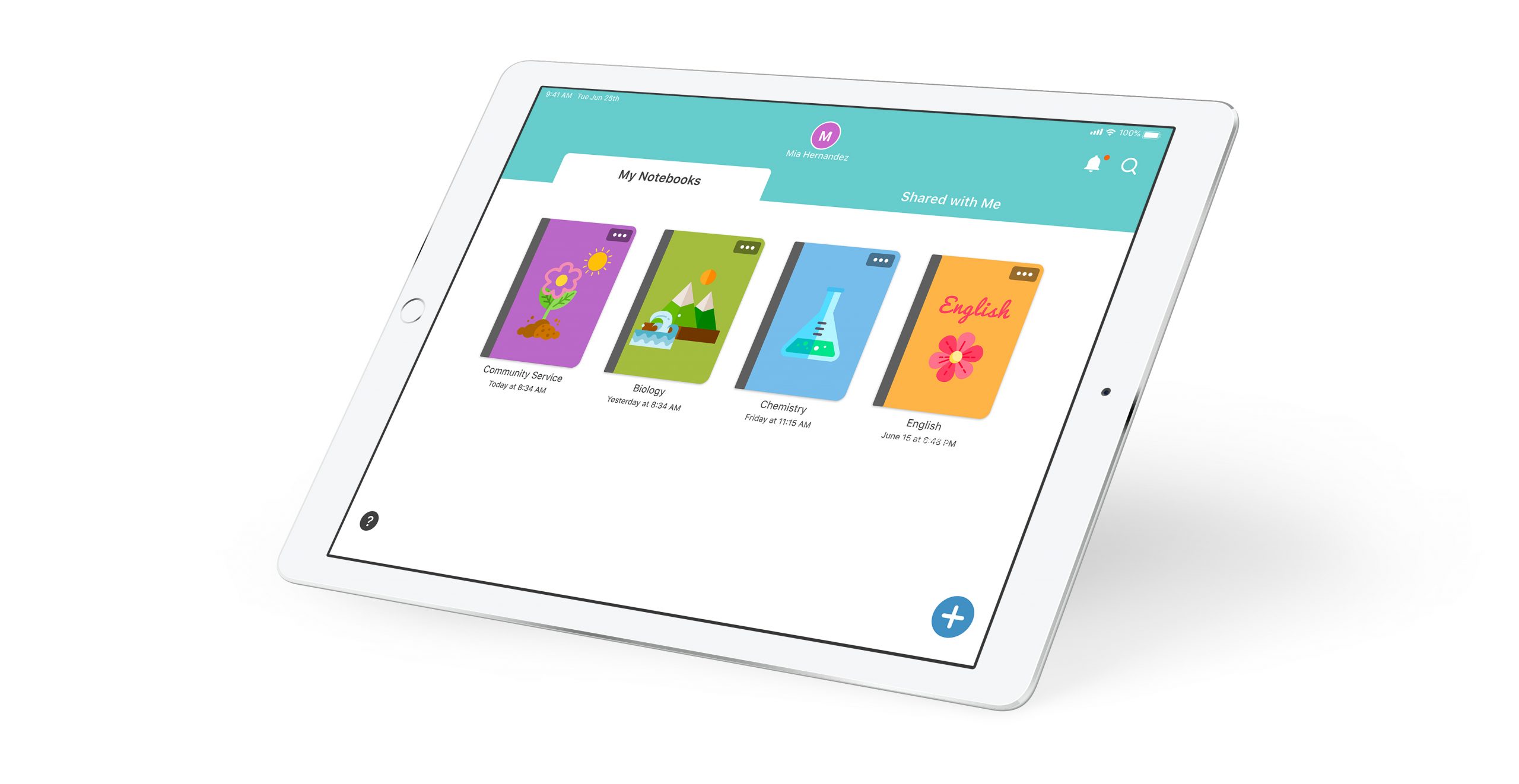
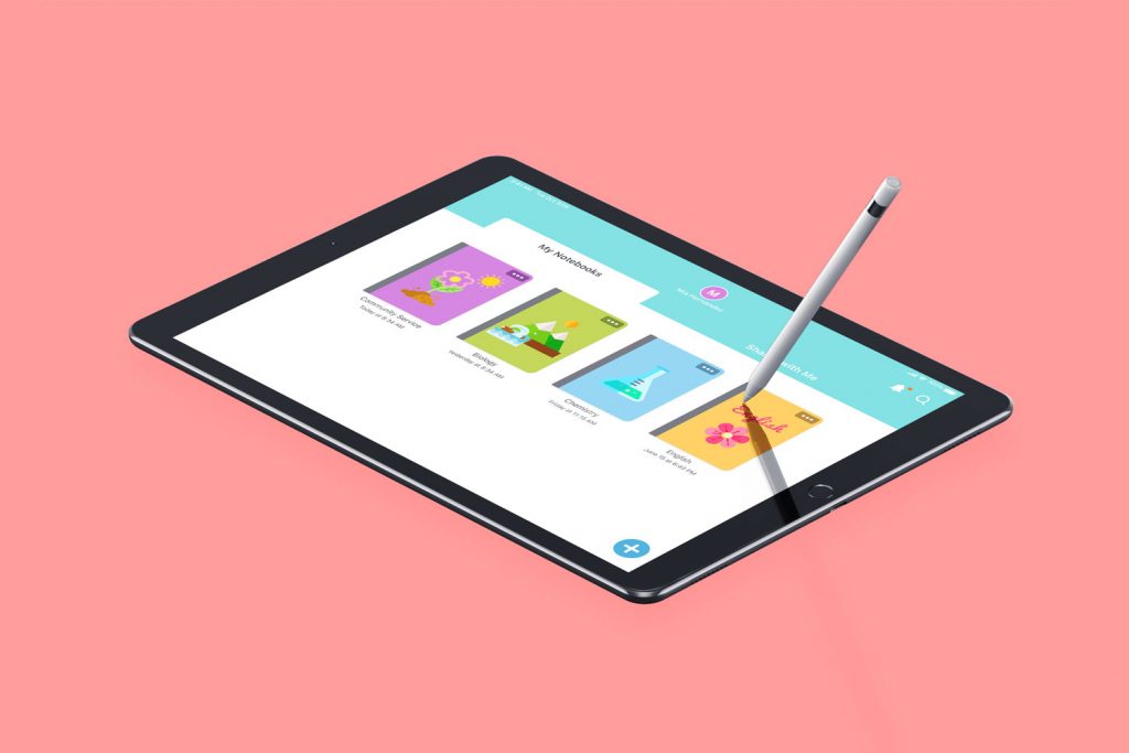
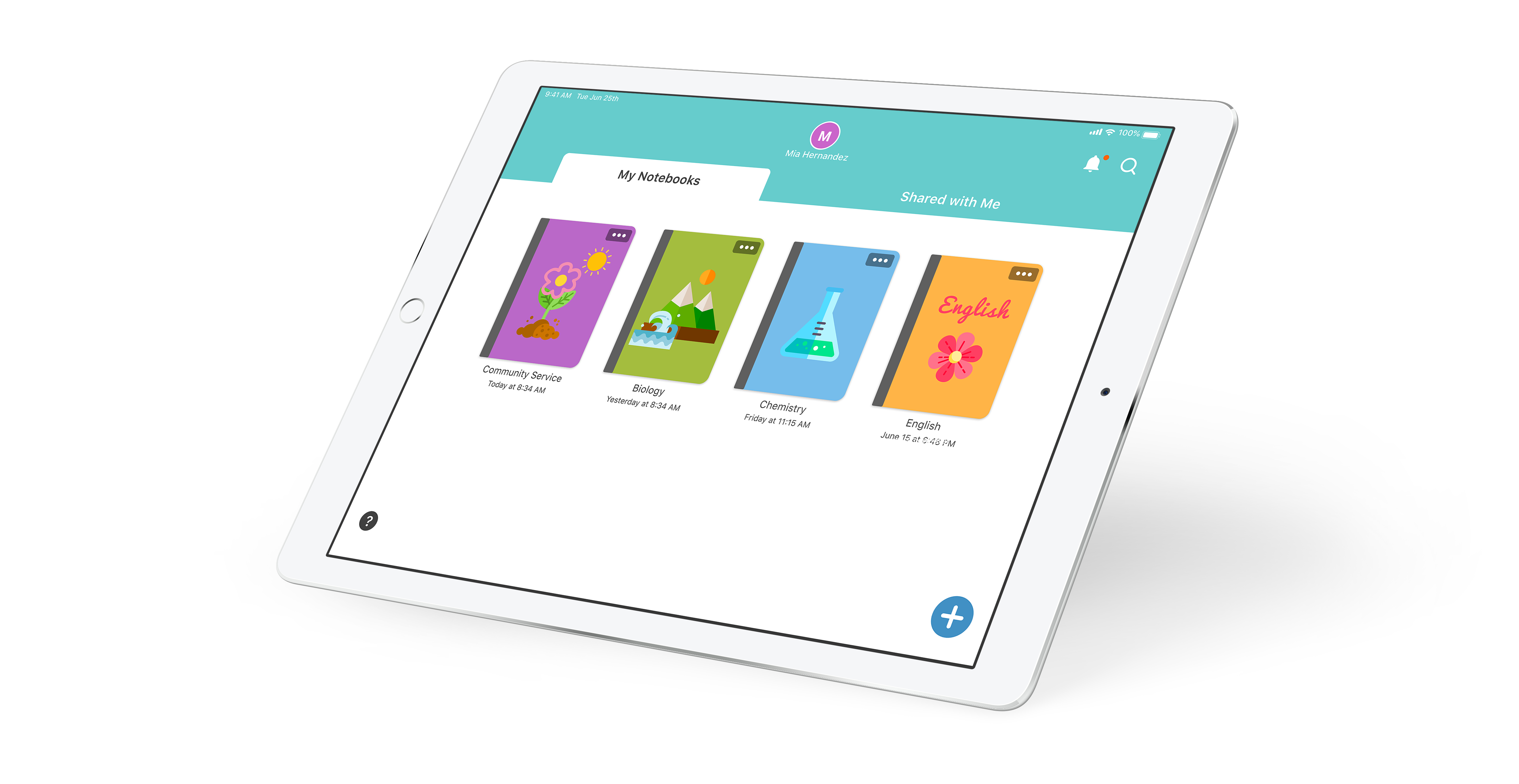
10 prototype development
Using the wireframes as a guide, we created the first version of our high-fidelity prototype. We focused on developing key user flows in the prototype to align with our usability testing goals and MVP. This allowed us to iterate quickly and collaboratively on design decisions and testing protocols. Throughout the process, we leaned on previous research, ideation, style guidelines, and client/team feedback.
We used Figma for real-time design collaboration within the team. Our goal was to create a clean and easy-to-navigate UI that would be suitable for students of a wide range of ages and technological literacy. We chose colors that aligned with the client’s style guide and leaned on design conventions from Google and Notability that our users would already be familiar with.
Before the prototype was ready for usability testing, the whole team went through several rounds of internal revision and testing, making sure that it functioned as needed and matched the user testing protocols.

11 usability testing
Testing goals
Our goals for usability testing were to understand usability problems that would impact the real-world use of the app, and to gather qualitative data for iterative design. Putting the prototype in front of actual users (teachers, students, and education department staff) helped us determine which design choices worked, and which needed to be changed.
Study design
Our research questions focused on UI, layout, information architecture, and key features. We developed scenarios for participants to aid them in task completion. Because we wanted qualitative feedback from participants in addition to task completion metrics, we asked a mix of open-ended and Likert scale questions after each task. We also collected overall feedback at the end of every testing session.
We conducted our usability testing on iPads with the Figma Mirror app to create an immersive and realistic experience for participants. We recorded screen, hand gestures, and audio. Five students and four teachers participated in our first round of usability tests.
"Honestly, I would love to use it for my everyday life. It’s pretty helpful and it’s really fun in its own way."
STUDENT
Prototype revisions
After testing, we synthesized our data to identify areas of improvement and expansion. Participants loved the UI and range of features, and felt that the information architecture was intuitive. However, they occasionally struggled to discover features and complete tasks without assistance.
Guided by our data, we built solutions to assist with discoverability and we prioritized features that were make-or-break for our participants. We revised the prototype with these changes and built out some new features for the second round of testing.
Additional testing
Our second round of testing allowed us to validate solutions and vet additional research-supported features not covered in round one. We wanted to delve deeper into users’ mental models around the core functions of the app.
We followed the same format as our first round of testing, with new participants– six students and three teachers. We performed A/B testing on a few key features as well as standard usability tasks and walkthroughs.
"The ability to customize it really makes it personal and helps with the process of learning."
STUDENT
"All the features I saw are immediately usable in the classroom. Seems very much like something I’ve been looking for."
Teacher
12 final deliverables
Prototype
Before finalizing our prototype for delivery to the client, we reviewed potential solutions to usability issues and chose the solutions that we felt were supported by our research.
We consolidated all prior feedback and research on features, flows, styles, elements, and information architecture to create the final prototype. We also standardized changes across all prototype screens, implemented consistent interactions, and designed new screens and interactions to fill in gaps.
Our final prototype was informed by a large amount of research, testing, and iterative design. We reviewed the current landscape of solutions, researched multiple related domains, performed observations, interviews, usability testing, and more. INK was built on user needs, and tested repeatedly with our target users.

Style guide
Our style guide for INK incorporates Monterey Bay Aquarium’s style guidelines and branding, while maintaining its own unique look. We used existing open-source icon libraries where possible, as they are already familiar to users, and we included text labels alongside icons for accessibility.

We kept the color palette simple, using color consistently throughout the app to identify similar types of interactions. Each UI decision was made with both younger and older users in mind.
INK’s distinctive style makes the app colorful and fun, yet also uncluttered and intuitive.
Documentation
We created a website with comprehensive documentation–technical, research, and design–to ensure seamless handoff to future teams.
Our technical documentation provides details about the app, how it functions, the information architecture, and how the app supports its users, while our process documentation explains how we made our decisions and what we learned.
Marketing video
In addition to our other deliverables, we produced a marketing video for INK. The video explains who the app is for, what it does, and why it’s an amazing tool for education across disciplines. Our client can share it quickly and easily to get buy-in from internal stakeholders as well as potential donors, which will help fund future development.
As Monterey Bay Aquarium is a nonprofit and relies on donations for funding, we made sure to deliver everything they needed to position INK for long-term success. Watch the video below.